.png)
Transforming a Seattle Craftsman Kitchen with Color: A Budget-Friendly Makeover
- Ashley Rajagopal
- Dec 31, 2024
- 3 min read
Clients with a limited budget painted their kitchen cabinets, walls, and trim to enhance the look and feel of their Seattle Craftsman.

When my first interior design clients purchased a classic Seattle Craftsman, they were eager to make it feel like home. The house had been painted a stark, bright white—walls, woodwork, and kitchen cabinets all shared the same harsh tone. While the white might work for some, it clashed with the warm butcher block countertops and wood floors, making them appear overly orange. It also didn’t suit my clients’ vibrant personalities. They reached out to me for a color consultation and help selecting furnishings that better reflected their style and the character of their home.
Though I’ve learned a lot since this project, the process we followed still looks beautiful years later. Here’s how we transformed their Craftsman kitchen using paint and a thoughtful approach to color without a full remodel.

The Challenge: Harmonizing Existing Tones
The first step I took was to document every existing finish in the home. I noted the dominant tones—most of which were orange or yellow-orange. The butcher block countertops had a light orange hue, while the wood floors leaned darker orange. Taupe carpeting in other parts of the home added to the mix. Against the stark white walls, these tones felt overwhelming.
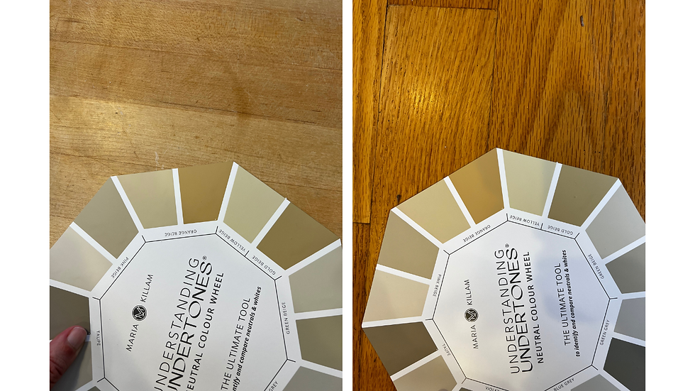
To guide my assessment, I used Maria Killam’s Neutral Color Wheel, a handy reference point to identify color tones and building cohesive palettes. While more advanced color tools exist, this wheel helped me quickly pinpoint the dominant tones so that I could then identify potential complementary colors.
Balancing Bold Décor with a Softer Aesthetic
In addition to the home’s finishes, my clients owned modern red and blue artwork and wanted to incorporate a red Persian rug into their living room. Their eclectic aesthetic called for a bold yet balanced color scheme that honored their style while softening the home’s overall feel to align with its Craftsman architecture.

Given their orange finishes and red-and-blue décor, a classic tetrad color scheme of orange, red, blue, and green felt like the perfect fit. The challenge was choosing shades that felt neutral and timeless while complementing with their existing features.

Choosing the Perfect Green for the Kitchen Cabinets
For the kitchen cabinets, I focused on finding a green that felt both classic and neutral. I focused on greens that had been toned down with gray to achieve a sophisticated look that wouldn’t overpower the space. We tested several samples, including Sherwin Williams Evergreen Fog, Benjamin Moore Carolina Gull, and Benjamin Moore Rolling Hills.
We purchased Samplize samples of our target paint colors, cutting them into smaller pieces to test across their cabinets at different angles. All of the samples were beautiful, but Sherwin Williams Evergreen Fog emerged as the winner. Its gray-green hue beautifully softened the orange tones in the countertops and floors, creating a calming yet stylish atmosphere.
Softening the Walls and Trim
While the new green cabinets alone would have a big impact, we further wanted to enhance the softer aesthetic by addressing the wall and trim color. To complement the kitchen’s new cabinets and unify the home’s palette, I selected light orange-beige and tan tones, testing options like Sherwin Williams Canvas Tan and Benjamin Moore Manchester Tan. Sherwin Williams Canvas Tan was the perfect choice, bringing warmth to the space without overwhelming it in both East-West and North-South facing walls.
For the trim and doors, we opted for Sherwin Williams Alabaster, a soft off-white with subtle yellow undertones. This choice added warmth and a touch of brightness, enhancing the overall cohesiveness of the home.
The Results: A Warm and Welcoming Craftsman Kitchen
By focusing on paint, we achieved a dramatic transformation with a modest budget. The green-gray cabinets, paired with warm neutral walls and soft white trim, brought harmony to the kitchen while allowing the home’s unique character to shine.


Admittedly, I was a little nervous going green in the kitchen when this project first started. But, the project ended up being a testament to the power of color and the impact thoughtful color considerations can have on a space. Whether you’re updating a Craftsman kitchen or exploring green paint options for your own home, choosing the right hues can create a space that feels both timeless and personal.
Are you considering painting your cabinets green? Or want to update your kitchen with a limited budget? Don't hesitate to reach out to Ashley Rajagopal Interior Design for expert advice! We offer a suite of services to meet your needs and budget!


Comments